Here’s what I got from Frank, which, I would like to point out, was
… “dictated and sent in my absence,” which is a pretty baller thing to have at the end of your emails that you can’t even be bothered to type out on your own! You’re a badass, I get it, Frank. Okay, the response: First, “I started to read your article with great interest and then it faded dramatically,” ouch. But I get it, and absolutely had that coming, since I’m some dipshit criticizing this incredibly important work of automotive design. I started to read your article with great interest and then it faded dramatically when I understood the point you were trying to make. Of course, taste is subjective, but the difference between good design and bad design is not subjective. It’s guided by science and the basic laws of proportion and balance. In a nutshell, the new MINI I designed is not a retro piece of work. I’ve explained often that it’s a product of 4 decades of imagined evolution. I arrived at the selected theme in my initial concept ideation phase with theoretically updated versions of the Mini for 1969, ’79, ’89 and finally ’99. In fact, I also added a vision of a potential ’09 design. All this took place in 1995 at BMW AG in Munich, Germany. I’ve never worked at Design Works in California. As a modern version of the original, it’s unimaginable for me that the R50 and the R53 would have upright round headlamps. That would certainly have antiquated the design, much like a person today using a monocle instead of contact lenses. In my opinion, a designer who stays tied to the past is not really a true designer. Designers in our industry are paid to innovate and improve. Moreover, the application of aerodynamics to automotive design has improved overall performance. Your reasoning behind keeping the original Mini’s upright headlamp design places aesthetics over performance, a principle I think that detracts from the true purpose and mission of good design. Best, Frank What I found especially interesting was the part where Stephenson clarified that he never considered the Mini a retro design, because he was basing his design on a series of imaginary updates to the original Mini. Honestly, I adore this concept, because it goes so much further than just updating an old design into a modern design vocabulary, but imagines a whole history that never actually happened–something that we here at the Autopian are especially fond of doing. The redesigns for 1969, 1979, 1989, and 1999 can be seen here, as sketched by Stephenson:
These sketches are interesting; the ’69 update shows a Mini that’s been smoothed and refined a bit in the details, while the ’79 one, with its elongated hood, perhaps suggests early attempts to improve crashworthiness? The ’89 one introduces the more sloping headlamp design that prompted my article in the first place, and the ’99 one is clearly very close to the 2001 R50 modern Mini. Stephenson discusses these imagined updates in this video:
Now, the real question here is: Do we think that these sketches and incremental Mini concepts were actually done before the 2001 Mini, or done afterwards to fill in the path? I don’t think we can ever really know for sure, and I’m not sure it even matters all that much. What could also be interesting to consider is that for some of these imaginary Mini updates, we kind of do have real-world counterparts. BMC did leave the basic Mini design alone for an incredibly long time, but it’s not like they never played with the Mini design. Take the Mini Clubman, for example, which appeared in 1969 and was what our reality had for a 1969 Mini re-design:
BMC modified the Mini from the A-pillar forward to give it a more modern look, and in doing so essentially abandoned the traditional Mini face. Of course, they made this alongside the original Mini look, so that wasn’t lost. Another fascinating real-world Mini redesign happened in 1974, when Innocenti, then part of British Leyland, re-bodied the original Mini to update its look, based on designs from Bertone, and the result was extremely modern-looking:
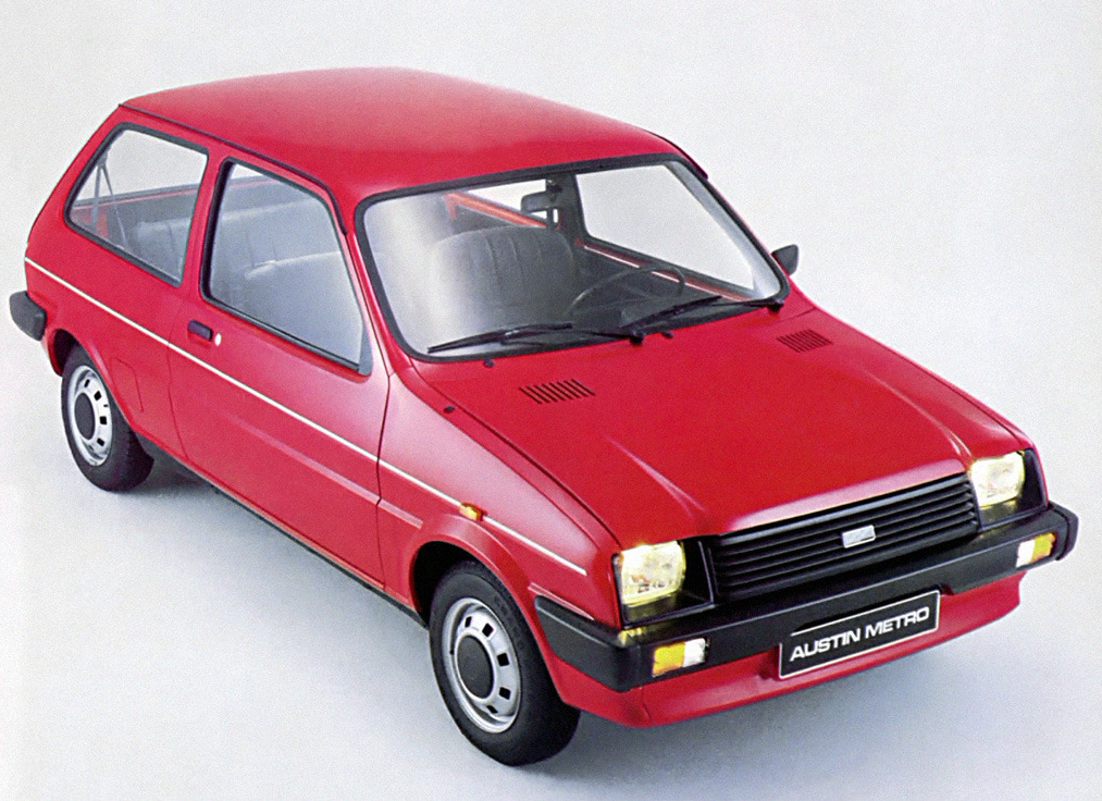
The Austin Metro, which arrived in 1980, could be considered reality’s redesigned Mini of that era, since the goal of it was to replace the Mini. As you can see, it owed almost nothing to the look of the OG Mini:
So, really, it’s not so much that British Leyland never attempted to redesign the Mini, it’s that they never attempted to redesign the Mini while simultaneously giving a shit about the look of the original Mini design–something that Stephenson’s imaginary Mini re-designs absolutely do, and, I think, despite what Stephenson himself says, does make them retro resigns since that’s the key to a retro design, isn’t it?–a respect for and attempt to translate key design cues to a more updated design language. But look: Stephenson designed the new Mini, and if he says the headlights have a damn good reason to look the way they do, then the headlights have a damn good reason to look the way they do.
I mean, I still think they look a lot like modern versions of this old Hella lamp, as I said, and I don’t think I’ll ever be able to un-see that, but I’m also happy to admit that I’m wrong.
Frank Stephenson has told me that the 2001 Mini headlights are the result of decades of imaginary evolution from the original, and that’s good enough for me. In fact, I like it even better now that I know a whole made-up history is involved, because, whatever you think of the design or its justifications, that’s just fun.
(Images: YouTube, Chasing Perfect documentary (2019), BMW, AROonline)
You might like Neil Young. He sings about rust!
Virtually every element of design is suboptimal in some way or another, so in fact this argument is merely a difference of opinion regarding what was most important in the redesign.
If upright round headlights were demanded by the CEO, you can bet your last dollar that Mr. Stephenson would have provided them in his reinterpretation of the original.
The tone of the letter was totally uncalled for. A true professional would apologize for such carelessness.
Oh fucking get over yourself, or at least read a book. Different people in different places, times, and cultures have preferred wildly different designs. The entirety of human history attests to the empirical fact that good design is in fact completely subjective, and if you’re a designer who can’t see that obvious truth, then you need to go broaden your horizons a bit. Otherwise, you risk making a complete and utter ass of yourself.
I took the opportunity of lockdown to finally getting around to watching all of The Sopranos, widely regarded as one of the greatest TV series ever. I generally wasn’t that impressed, finding it a bit soapy and the characters for the most part reprehensible, unlikable and not able to change. Does that diminish it’s acheivements as a series? No, it just wasn’t for me.
Part of a designers job is to make a car work visually – to balance the volumes, proportions and graphically elements to work harmoniously together, and to reflect it’s function as a vehicle. There are fundamental rules as to how all of this works, in how the various parts relate to each other. This is not subjective – pick a poor design and I (or any of the other pro designers on this site) will be able to tell you what’s wrong with it and why. Likewise, pick something you don’t like and everyone else does and I’ll be able to do the same.
Just because you don’t like something, that doesn’t mean it’s bad. It’s just not for you.
I think he already did. 😉
Says a man selling t-shirts that look like they came from Radwood.
The number 1,2,&3 highest selling vehicles in US for decades are pickup trucks. The whole front design has continued to move towards the proverbial flying brick wall look.
Tell me how that fits with this “bad design”. At least for trucks, they continue to be the real money-makers in US and the scale tilts WAY more to looks rather than other. Otherwise, all these manly looking trucks would be rounded off, cute and cuddling looking.
We’ve come a long way from the old GM400s, which I think were a masterclass in looking modern and assertive without being overdone.
Frank clearly laid out that he created these sketches retroactively as a design exercise – I don’t see where the doubt is? They 100% were done while he was designing the 2001 Mini.
I’m in the design industry (buildings, not cars). But in studio classes, you quickly learn how to figure out how to explain (what I call “post-rationalize”) how you arrived at a concept to a critic with complete, but believable, bull$hit. At the end of the day, does it matter? It does create a compelling story.
Anyways. They still look very good. Better than the newer versions, I think. Less bloated, nimbler, simpler, less gimmicks. I think it’s one of Stephenson’s best. He has a lot of good designs that seem to get better with age, and the Mini is one of them I believe.
And yes, it look infinitely better with Frank’s headlights than with Torch’s upright ones. No contest.
It wasn’t until BMW came on the scene in the mid ’90s that there was any thought that a new Mini needed to stylistically resemble the original Mini, until then, the focus was always on a contemporary, modern design with no retro touches. Rover’s in-house ’90s alternative was the insanely space efficient rear engine Mini Spiritual concept, which was almost radically modern looking, which they thought was a good idea, in case the car ended up doing another 40 year production run
Anyway when it comes to design, art, architecture and music I would be surprised if it turns out expert systems can do those things better and faster than any human. I know all the stories with robot uprisings have us winning because of human originality or inventiveness but is there any evidence that’s true? For some, sure, but plenty of people I meet have the imagination of a brick.
And Frank, your views are subjective. Also, I bet you don’t ride that longboard behind your desk.
Not to say that the widget enthusiast can’t voice their opinion, but if a defacto authority on widgets enters the chat, I think you just have to listen.
You took it on the chin in stride at least!


.jpg)

